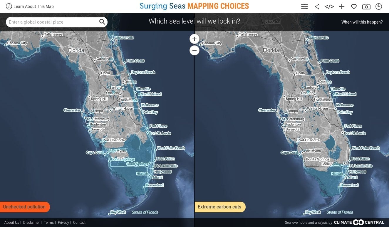
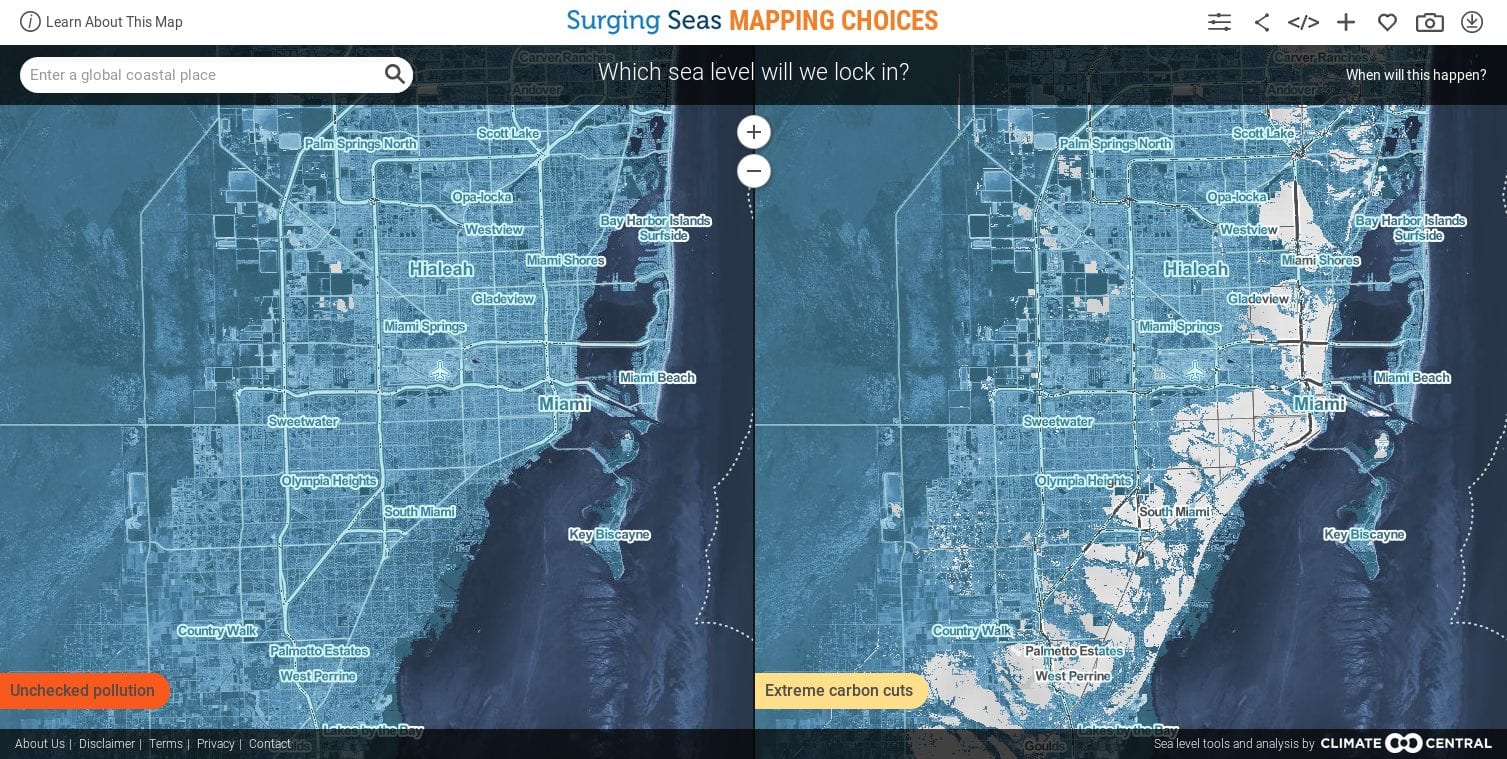
Visualization of Florida Sea Levels
Comparison of high vs. low carbon pathways lock in.
There are two timeframes to these maps. The first is: When do we pass the point of no return, and lock in the future sea levels shown?
Maps that compare carbon scenarios show long-term sea level projections based on different pollution pathways through 2100
The second timeframe is: When will the sea actually reach the heights shown?
The answer could be sooner than 200 years from now (see Table 1 in this scientific paper), or as long as 2,000 years (see this paper). Why the wide range? It is easier to estimate how much ice will eventually melt from a certain amount of warming, than how quickly it will melt, which involves more unknowns. The same simple contrast would apply to an ice sculpture in a warm room.
Global warming has raised global sea level about 8 inches since 1880, and the rate of rise is accelerating. Rising seas dramatically increase the odds of damaging floods from storm surges. A Climate Central analysis finds the odds of “century” or worse floods occurring by 2030 are on track to double or more, over widespread areas of the U.S. These increases threaten an enormous amount of damage. Across the country, nearly 5 million people live in 2.6 million homes at less than 4 feet above high tide — a level lower than the century flood line for most locations analyzed. And compounding this risk, scientists expect roughly 2 to 7 more feet of sea level rise this century — a lot depending upon how much more heat-trapping pollution humanity puts into the sky.